Conjecture: READ ME! Please
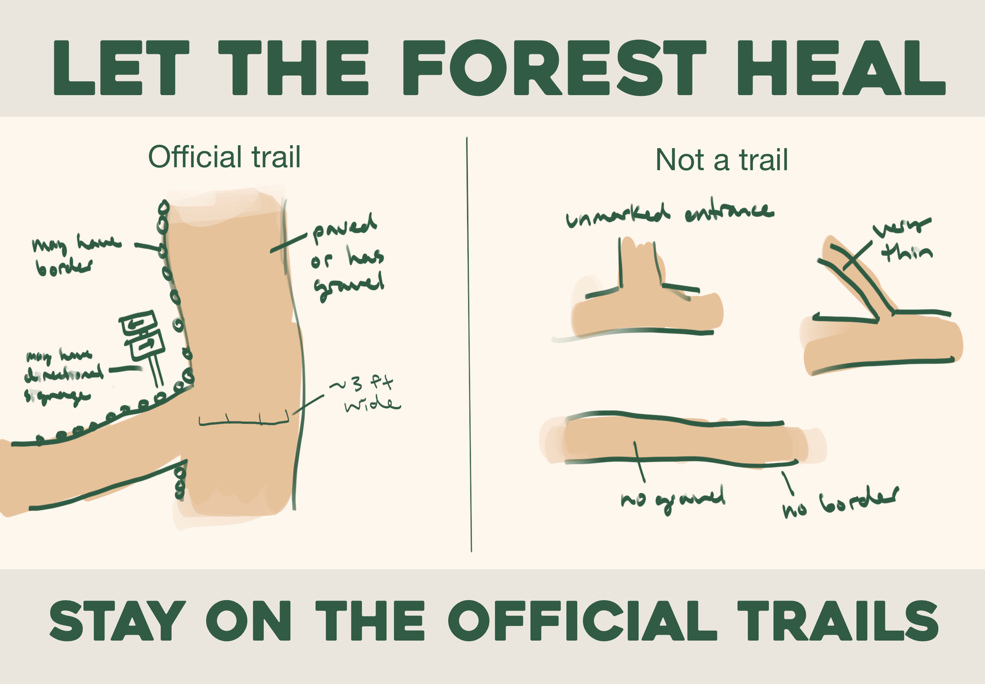
This conjecture consists of different signs that could be placed at state parks to discourage littering and encourage visitors to stay on official trails. While creating the signs, I tried to employ the techniques discussed in the paper by Rice et al. on graphic design in park signs (2023), including: typography as image, high contrast between background and text, scale shifts from headline to call-to-action, and 'rewarding' visitors who pay close attention with details or more information.
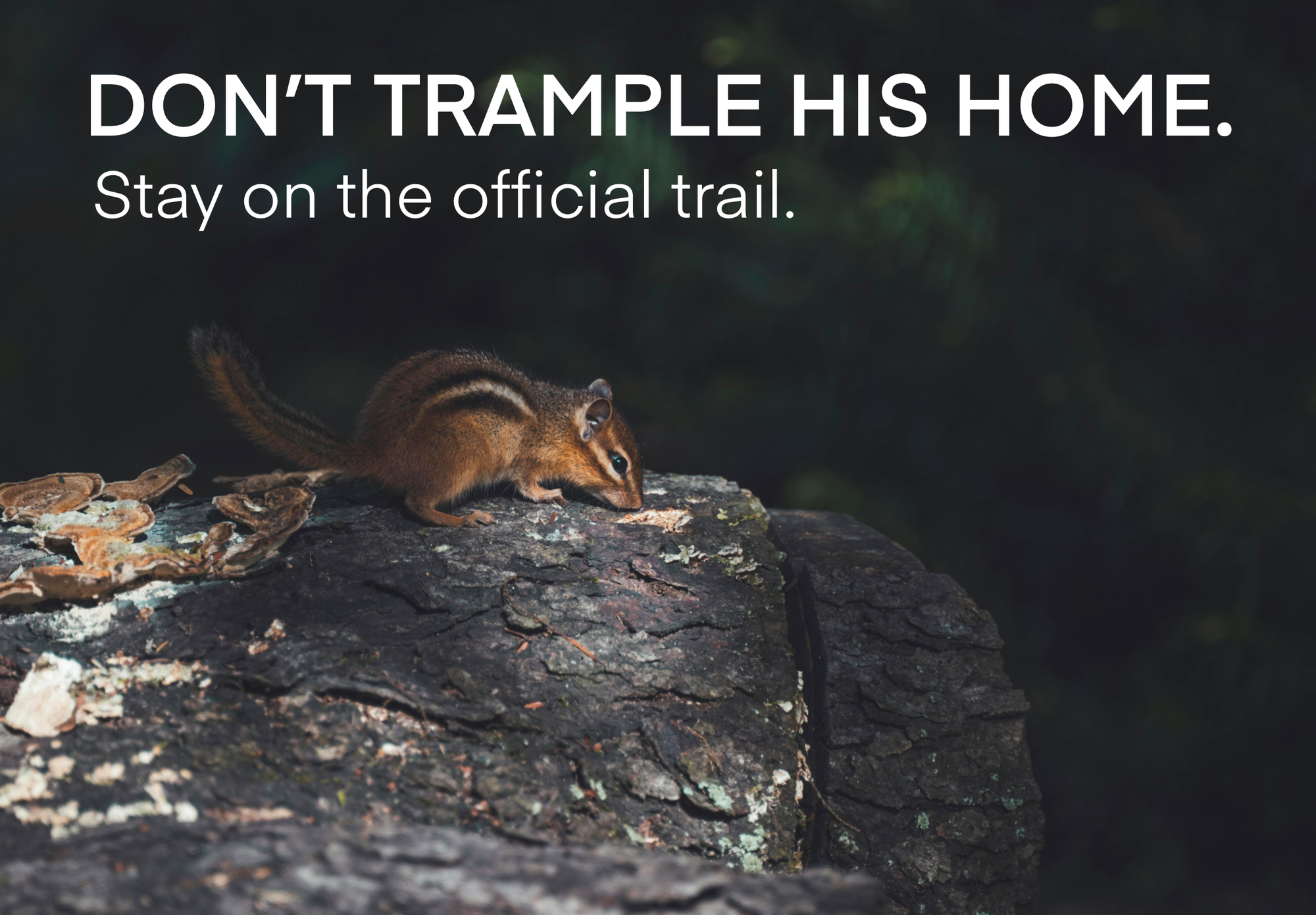
To explore the difference of effectiveness between positive and negative signs, I aimed to create some that use guilt or other negative emotions, and some that aim to create a positive emotion such as pride.
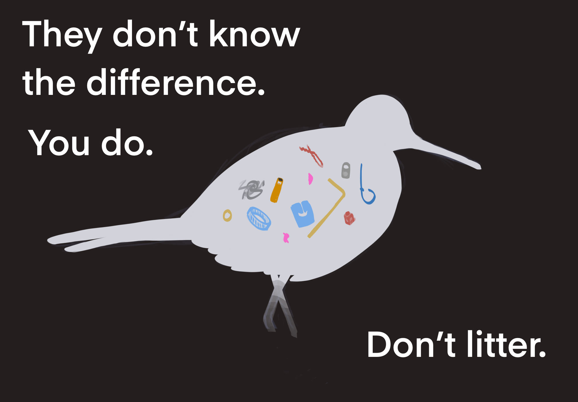
Response: "Aww, that's sad."
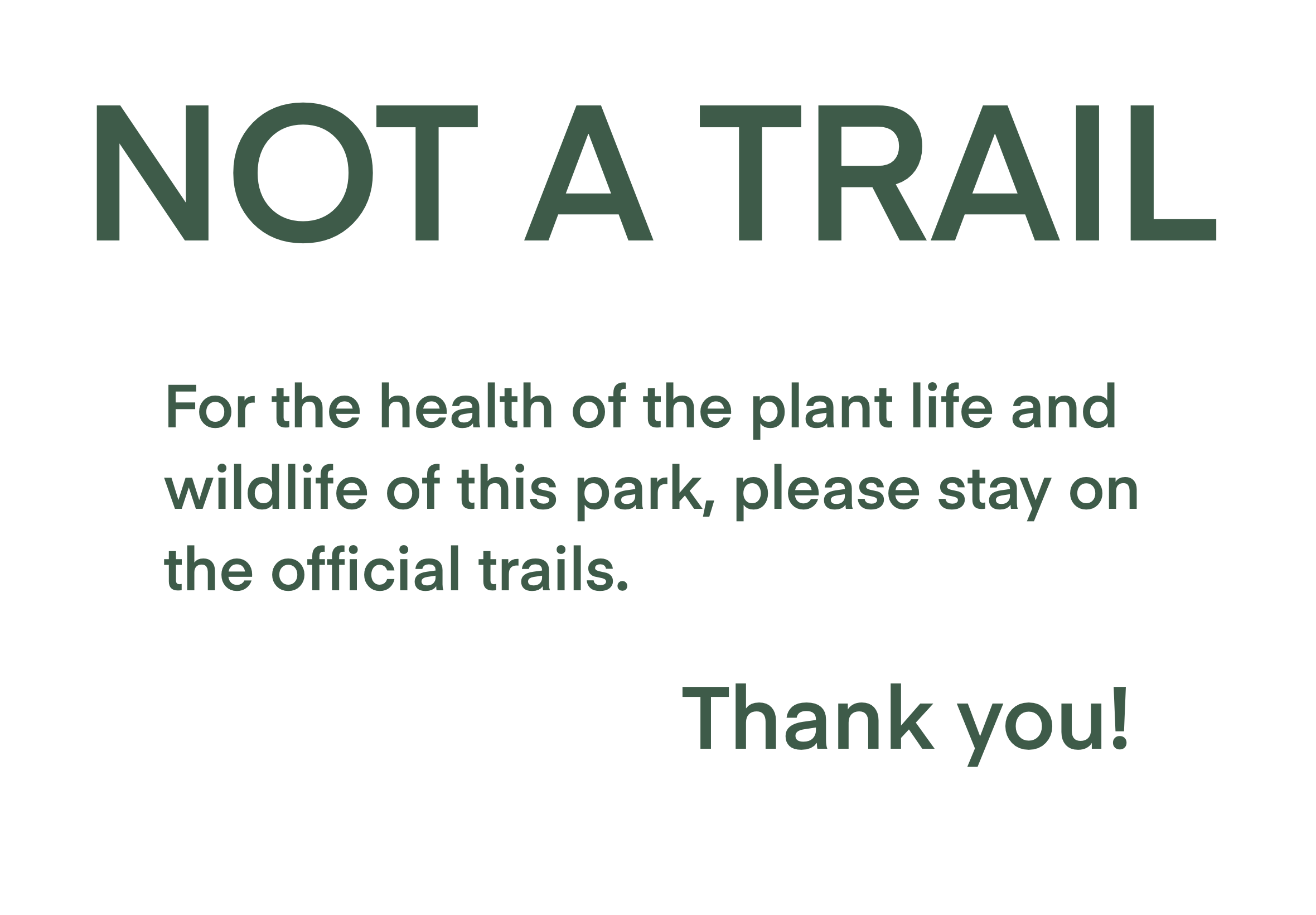
Could be "You know the difference. They don't." More powerful end statement than "You do." "Don't" could be a different color and/or underlined both times it appears for emphasis.
It's also not clear what each of the plastic/trash pieces are. If you make all the trash shades of red and also make "don't" or "litter" red, it might be more clear what's happening.
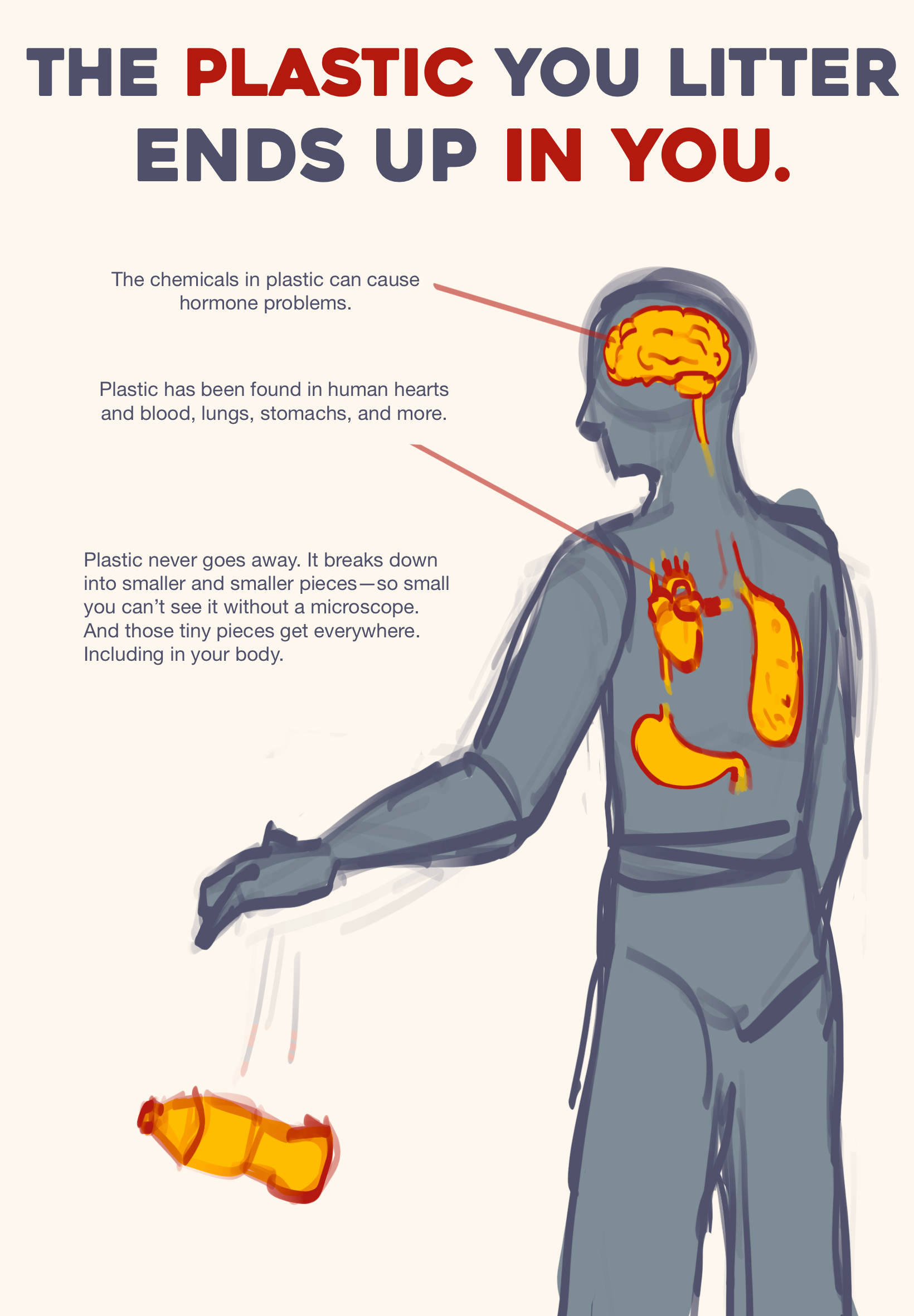
There's a lot of text in one place--moving the larger paragraph to the bottom would match better with the visual movement downwards and make it less overwhelming to read. Alternatively, a short message at the bottom by the bottle could complete the visual movement downwards.
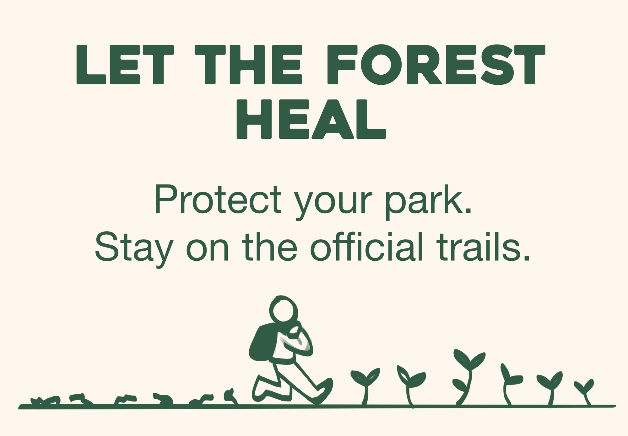
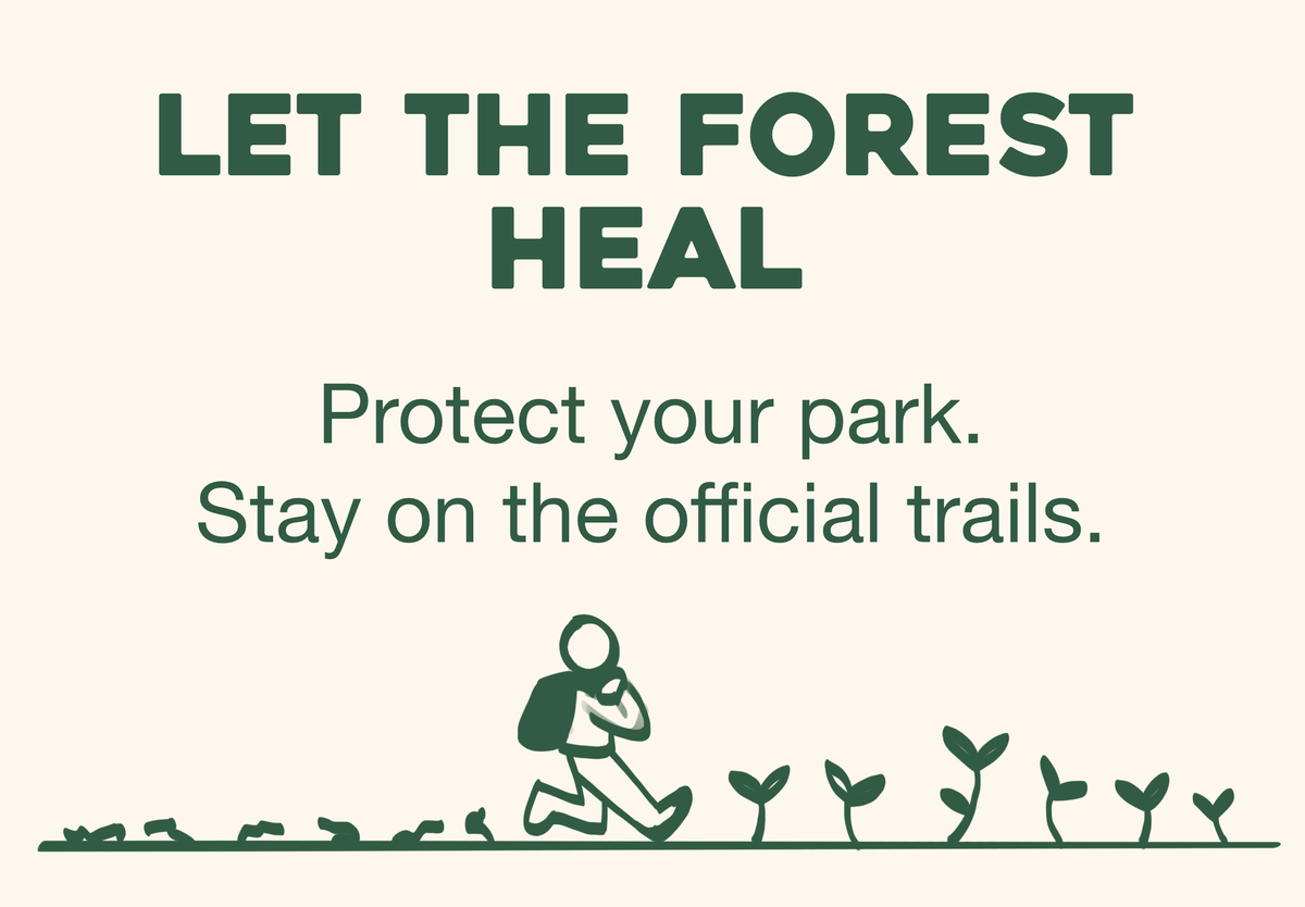
Making the trampled plants brown would make it more clear that they're dead/dying. Overall, a more positive approach.
Resources.
Greenpeace. (2025). The impacts of plastic on human health. Greenpeace USA. https://www.greenpeace.org/usa/plastics-and-health/
National Geographic Education. (2016, November 9). Animals Eat Plastic Because It Smells Like Food. https://education.nationalgeographic.org/resource/animals-eat-plastic-because-it-smells-food/
Rice, W. L., Shellhorn, J., Bloomgren, V., Booth, L. Duncan, S., Elias, J., Flowers, K., Gambini, I., Gans, A., Medina, A., Obadare, D., O'Neill, C., Rooney, Q., Scherck, G., Schmidt, K., Thomas, C., Thomas, E., Walhus, G., Whitney, P., Winckler, C. (2023). The Impact of Graphic Design on Attention Capture and Behavior Among Outdoor Recreationists: Results From an Exploratory Persuasive Signage Experiment. Journal of Outdoor Recreation and Tourism, 42. https://doi.org/10.1016/j.jort.2023.100606.
York County Conservation District. (2021). Low impact recreation: protecting our forests. York County Conservation District. https://www.yorkccd.org/wp-content/uploads/2021/11/Low-Impact-Recreation.pdf
Zero Waste Scotland. (2023, February 21). Some of the best litter prevention campaigns from around the world. Zero Waste Scotland. https://www.zerowastescotland.org.uk/resources/some-best-litter-prevention-campaigns-around-world
No generative AI was used in the creation of this post or its content.