Graphic Design in Park Signs
Considering the effectiveness of signage to encourage low-impact behavior and preventing impactful behavior in state parks, I looked for research on the practice of visual communications in the context of outdoor recreation. Rice et al. (2023) published an article on the topic, titled The Impact of Graphic Design on Attention Capture and Behavior Among Outdoor Recreationists: Results From an Exploratory Persuasive Signage Experiment.
Excerpts from Rice et al. (2023)
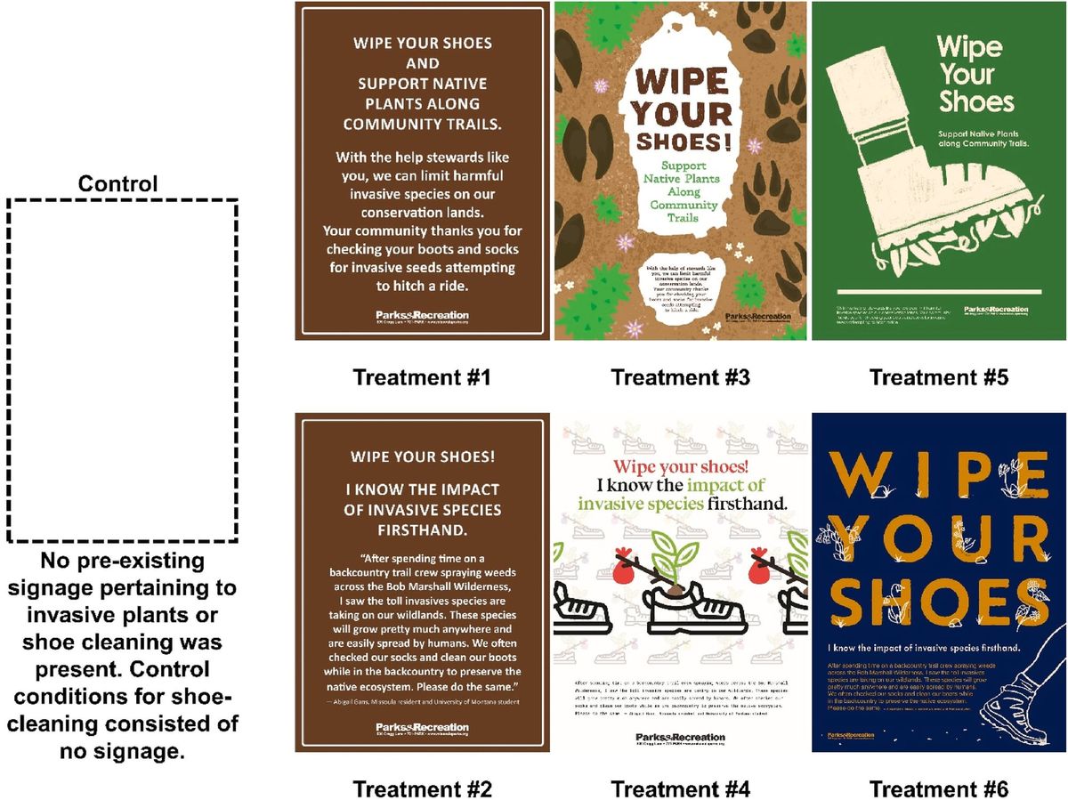
This exploratory research sought to answer the following research questions: 1) Does graphic design influence visitor attention capture in park and protected area signage? 2) Does graphic design influence visitor behavior through park and protected area signage? This study employed an experimental design of 6 signage-treatments incorporating diverse graphic design elements to address two separate management issues—dogs-off-leash and the spread of invasive plant species—at a popular trailhead in Missoula, MT. Results show that both administrative and graphic design signage treatments promoting shoe-cleaning to stop the spread of invasive species proved effective in capturing attention of visitors, suggesting that managers should incorporate both attractive and authoritative elements in park messaging. In regards to influencing visitor behavior, two design treatments incorporating high color-contrast, large “scale” shift and “typography as image” elements proved the most effective for both management issues. These findings indicate that graphic design encapsulating persuasive language is very important to capture visitor attention and influence behavior, and design elements should be considered seriously by park managers when employing various communication strategies.
The mixed results of treatment performance (between administrative and graphic design treatments) in regards to visitor attention capture indicate that signage designers should seek to balance attractive and eye-catching graphic qualities with graphic qualities that communicate authority.
Results suggest that if managers are able to minimally capture visitors’ attention, they will dramatically increase their odds of influencing visitors’ behavior. If visitors take the time to read and elaborate upon the messaging on the signs, the odds of influencing behavior are even more dramatic.
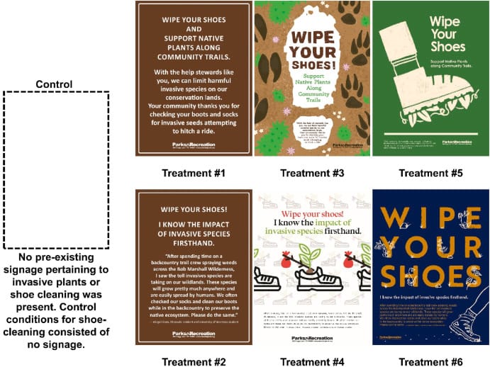
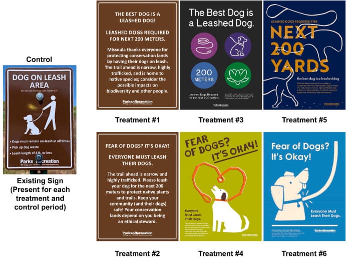
Unlike attention capture, we found significant variation in behavioral influence among both the shoe-cleaning and dog-on-leash treatments. Notably, among the shoe-cleaning treatments, Treatment 6 preformed significantly better than all of the other treatments—including administrative and other graphic designs. Similarly, among the dog-on-leash treatments, Treatment 5 preformed significantly better than both administrative designs. Treatment 6 of the shoe-cleaning treatments and Treatment 5 of the dog-on-leash treatments were designed by the same designer using the same graphic style. This style uses a strategy called “typography as image” (Meggs, 1988) where the text “Wipe Your Shoes” appears hand drawn with native plants “growing” in and around it. This strategy creates visual efficiency as the reading of text and imagery happen concurrently as they are “fused” (Meggs, 1988) and is a tool that many designers of posters, signs, billboards use because communication has to happen quickly.
Additionally the style of Treatment 6 (shoe-cleaning) and Treatment 5 (dog-on-leash) creates “high-contrast” because of a darker color background and lighter color text. A large “scale” shift between the headline “Wipe Your Shoes” and the call-to-action below also grabs a viewer's attention. Lastly, this treatment moves beyond just asking the viewer to wipe their shoes, it also connects with the viewer by showing some of the native plants that their behavior may protect. This creates an additional narrative for a visitor to read and rewards the viewer that takes a closer look at the design.
The specific visual communication techniques that Rice et al. (2023) found most effective—typography as image, high contrast between background and text, and a large scale shift from headline to the call-to-action—are something that I will keep in mind when designing any visual or signage components in my capstone project. The idea of 'rewarding' a visitor that pays close attention to a sign or design is an interesting one, and might inspire further thought in the context of not only signage design but physical design as well.
References.
Rice, W. L., Shellhorn, J., Bloomgren, V., Booth, L. Duncan, S., Elias, J., Flowers, K., Gambini, I., Gans, A., Medina, A., Obadare, D., O'Neill, C., Rooney, Q., Scherck, G., Schmidt, K., Thomas, C., Thomas, E., Walhus, G., Whitney, P., Winckler, C. (2023). The Impact of Graphic Design on Attention Capture and Behavior Among Outdoor Recreationists: Results From an Exploratory Persuasive Signage Experiment. Journal of Outdoor Recreation and Tourism, 42. https://doi.org/10.1016/j.jort.2023.100606.
No generative AI was used in the creation of this post.