The Youngest Shareholders: Designing for Children
As designers, one of the most common traps while creating solutions for a client is assuming that you operate on the same wavelength as them. While designing for children, one must consider the difference in psychology, motor skills, and logic development as shown by UX designer Andrew Smyk:
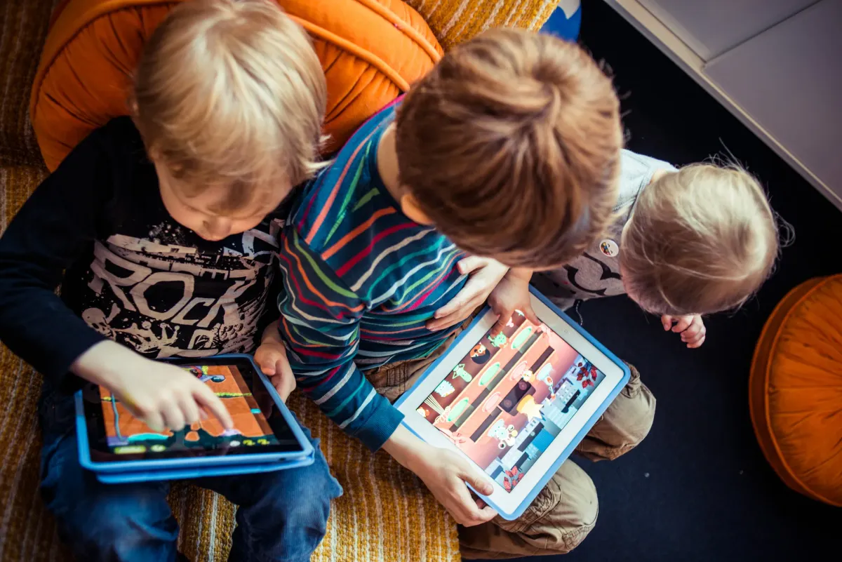
I have been observing my kids (and their friends) using tablets and other touch devices. Children interact with content primarily with taps, finger drawing or tracing, drag and swipe. Tap is the most intuitive and natural interaction gesture that children use. Pointing is the one of the first ways in which children communicate with the world around them to show their caregivers what they want. Tap is simply pointing on the UI surface. The child wants something, the child points by tapping the interface.
Designing for children requires the interface to be reactive to their input style. For interactions consider using onPress events rather than onRelease events. A child’s natural gesture is to tap and hold, rather than tap and release. Avoid using double tap. Think about the immediacy of the interaction. The use of a double tap (tap-tap) is a learned interaction. A child’s focused interaction is tap (hold, release), tap (hold, release).
One of the major problems for children is not exploration or interaction but ending the engagement with the interface by accidentally removing themselves from the experience. This often happens through accidental navigation or presenting the child with modal (pop-up) windows that takes them away from the current app or site. Whether this is in the form of clickable banner ads, “rate this app” or “do you wish to continue” modal windows. Swipe gestures that move the child to a different section should also be avoided, unless the child is prompted by the application.
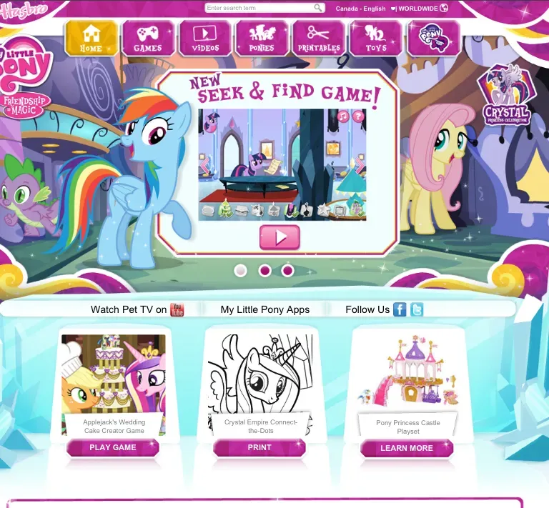
Design with little readable text. Assume the child cannot read or requires assistance with instructions. The children’s section of the Netflix website is a great example of navigation designed with children in mind and actions that require parental help. In the Just for Kids section, the primary navigation is by means of characters from the various video titles. A child can recognize a favorite cartoon character, tap or press the character and is taken to all the videos from that particular character or program. Another example is the My Little Pony website, where sections are navigated with arrows and character images.
One of the most important aspects about designing for children that Smyk points out is the existence of learned interactions. Children could become frustrated if a program expects them to know something they don't. A second evaluation of what interactions are needed to operate a child-targeted program or product is needed to prevent this.
Additionally, designers should avoid adding state changes triggered by mis-timed interactions or underdeveloped motor skills. The example of avoiding swipe gestures is valid; I would also consider mis-inputs due to liquids (common with touchscreens) and voice activation unideal.
Reorienting the understanding of the user from adult to child is needed to prevent frustration with design decisions. Perhaps observation over existing learned behaviors for children in cars would be beneficial for creating a solution for Honda.
References
Smyk, Andrew. 2014. Medium. "Design Considerations for Little Fingers". https://uxdesign.cc/design-considerations-for-little-fingers-ad2a19ed3816
Toca Boca. 2013. Flickr. https://www.tocaboca.com/
All original works in this article were done without the assistance of AI tools.