Are Too Many Screens a Thing?
In Cars are getting dumber, Drew Gooden (2024) questions design changes that make ordinary vehicle functions harder to understand. His most useful example begins with his own mistake. While trying to avoid a closing gate, he pressed the reverse button, accelerated, and moved forward. He accepts responsibility and offers a possible explanation for the rejected gear change, rather than a confirmed mechanical diagnosis.
“there would’ve been physical feedback to tell me it was still in drive” (Gooden, 2024, 4:28).
3:38–4:55: Gooden argues that a physical selector could have made the unchanged gear position easier to recognize. With the button interface, he describes needing to check the dashboard to confirm which gear the vehicle had actually selected.
I think the useful issue here is the difference between requesting an action and knowing it happened. Pressing a button can feel like completing a task, even when the system rejects the request. A safeguard may be working correctly while the person misunderstands the result. That makes confirmation part of the control itself, especially in a situation where someone is already panicking.
“they give the illusion of luxury” (Gooden, 2024, 8:12).
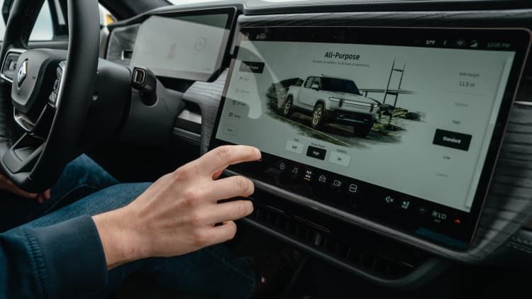
8:04–9:31: Gooden criticizes moving routine controls into a central touchscreen. His vent example involves opening climate controls, selecting a vent, and dragging its airflow direction on the display, adding several steps to an adjustment previously made directly by hand.
That example makes me question how designers judge simplicity. A dashboard can have fewer visible parts while requiring more decisions from its user. I would want to count what the person has to find, select, and confirm. The work still exists, even when it has disappeared from the surface.
The video refers to a Swedish comparison that is worth checking directly. Vi Bilägare tested twelve cars at an airfield, with drivers familiarizing themselves with the controls beforehand. Its results table reports 10 seconds for four task groups in a 2005 Volvo V70, compared with 44.9 seconds in an MG Marvel R. The tasks included climate adjustments, radio tuning, and resetting the trip computer (Diits Vikström, 2022).
Those are task-completion times, and should not be interpreted as continuous time looking away from the road. The magazine also found relatively quick performance in touchscreen-equipped models, including the Volvo C40. For me, this supports evaluating the arrangement and complexity of the controls rather than deciding from the presence of a screen alone.
Reflection
I think Gooden’s video is useful because it makes me question what I would accept as an improvement in my own design. I can become attached to a clean surface or an unfamiliar interaction because it looks resolved in a presentation. The harder question is what happens when someone is rushed, confused, or uses it for the first time. I would want a design to make the next action and its result easy to understand. My conclusion is that a new interface should justify the effort of learning it through a clear benefit during use, especially for something people operate repeatedly.
References
Gooden, D. (2024, April 25). Cars are getting dumber [Video]. YouTube. Watch the video.
Diits Vikström, F. (2022, August 17). Physical buttons outperform touchscreens in new cars, test finds. Vi Bilägare. Read the original test.