Who Said This Was Ugly?
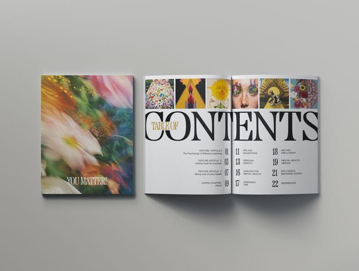
Forget white space, good taste, and luxury—in independent magazine publishing it’s the ugly, the untidy, and the cheap that rule right now. (Jamieson, 2016)
A group of independent magazines intentionally moved away from the clean and polished style that was common in design. Instead, they used messy layouts, unusual fonts, bright colors, strange images, and designs that could look confusing or even ugly. They did this because they wanted to challenge the idea that there is only one way for something to look “good.” So instead of following the design rules people were already used to, these magazines experimented with styles that felt unfamiliar and different.
An important part of the article is how this can change people’s perception of what they find attractive. When people are repeatedly exposed to the same clean and organized styles, they can become used to seeing those qualities as good design and then things become almost expected. Anti-design magazines challenge that by giving people new visual references, something that may initially look strange or unattractive can start to feel interesting or intentional when people understand the idea behind it and continue seeing it used in a creative way. Over time, this can expand what people consider good taste.
There’s a growing movement away from the clean, oh-so-tasteful design of high-end indie mags. As the elements that once made a certain kind of independent magazine feel so fresh become, dare we say it, a little cliché, a growing subgenre of indies are shaking things up, ensuring that the most exciting print publishing phenomenon of our times stays just that. These “anti-indies” spit in the eye of the prevailing aesthetic of smart, minimalist restraint in favour of uneasy layouts, nasty fonts, and a more-is-more sensibility. (Jamieson, 2016)
By breaking familiar design rules and repeatedly showing people something different, these magazines gave people a new way to understand what good design could look like.
Readers and publishers are hungry for mags that challenge convention and offer a more authentic experience, but does that mean it’s all over for more minimal titles? ...Of course we should call the clichés out, but don’t tar the originals with the copies. (Jamieson, 2016)
Trends spread like viruses, it’s unavoidable. A type trick here, a color combination, a paper stock… we’re all open to infection by a trend. Right now the cliché epidemic involves clean white pages of minimalist typography with overzealous detail of obscure coffee -Making Methods
People's perception on trends change, and magazines are a good way of pulling people towards a new trend. Through this article I have learned that little design changes can make people see the beauty in something that has been considered "good"...yet.
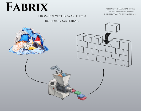
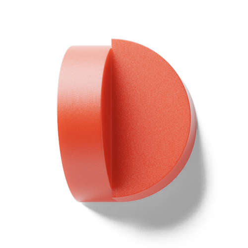
This connects to my Marble Plastics research because the secondary waste does not have the controlled appearance of the company’s main material. Instead of trying to make it look “perfect,” the design could embrace its unpredictable colors and textures. By intentionally using and presenting those qualities, the waste could become something people recognize as unique and desirable rather than simply leftover material. The anti-design was not about saying that ugly design is better than good design. It was about questioning why certain styles are automatically considered attractive in the first place. Taste is not completely fixed. What people find attractive can change when they are introduced to new ideas and see them used intentionally.
Reference
Ruth Jamieson. (2016, May 11). The New Wave of Anti-design Magazines Will Question Your Sense of Taste—and That’s a Good Thing. AIGA. https://eyeondesign.aiga.org/the-new-wave-of-anti-design-magazines-will-question-your-sense-of-taste-and-thats-a-good-thing/